Posted: Thu 5 July, 2012 | Author: Lyle | Filed under: Design, Driving, Thoughts |
And again, some thoughts about the M1 during the works. This time, it’s about the new electronic signage…
Motorway signage (as well as other road signs) always used to be designed for clarity, so they could be read and understood at distance/speed. However, this doesn’t seem to apply so much to the latest generation of electronic signs.
There are two in particular that are nearly impossible to differentiate at speed.
You can see the problem, I expect – in both cases, the yellow ‘information’ consists of, effectively, a triangle of colour. From a distance, you can’t tell which is which.
It’s probably not massively relevant, I suppose, as both signs indicate “You’re going to be here for a while”. But still, they’re hard to differentiate.
Posted: Sun 20 February, 2011 | Author: Lyle | Filed under: Design, Domestic, People, Thoughts, Work-related |
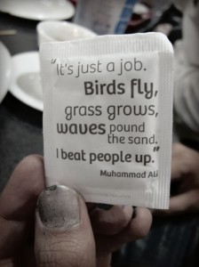
Via the Koriblr tumblr feed…

It's just a job - attributed to Muhammad Ali
Definitely something to remember when the workplace gets skanky
Posted: Mon 7 February, 2011 | Author: Lyle | Filed under: 1BEM, Agency Idiocy, Business, Cynicism, Design, Geeky, People, Stupidity, Work-related |
Via the linguistic/literacy genius known as Sevitz (or Svetzi) comes this gem…

Oh. My. God.
I’ve worked with some spectacular options for Yes/No, but this one is way up there.
Posted: Thu 28 October, 2010 | Author: Lyle | Filed under: Advertising, Design, Domestic |
I’m not a massive fan of the advertising world’s “Chip Shop Awards“, although they’re certainly good for making you think.
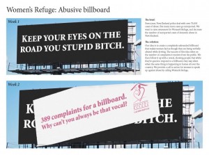
One particular case in point is the advert in the image below…

Abusive New Zealand Billboard
The text from the advertising agency is :
The Brief : Every year, New Zealand police deal with over 70,000 cases of abuse. But many more cases go unreported. We want to raise awareness for Women’s Refuge, and decrease the number of unreported cases of domestic abuse in New Zealand.
The Solution : Our idea is to create a completely unbranded billboard that makes women feel as though they are being verbally abused while driving. The success of this idea relies on the number of complaints it receives from the public. We then follow it up with a reveal, showing people that while they’re quick to respond to a billboard, they stay silent when the same thing is happening in homes all over the country. We provide a call to action for women to speak up against abuse by calling Women’s Refuge
To me, that’s genius. Love it.
Posted: Mon 11 October, 2010 | Author: Lyle | Filed under: Design, Education, Media |
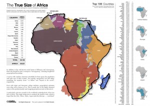
via Twitter today, I came across this awesome infographic about the true size of Africa by Kal Krause.
I’ve also uploaded it here, because it really is an excellent illustration of the size of Africa, compared to other major areas/countries.

The true size of Africa, copyright Kal Krause
Posted: Tue 10 August, 2010 | Author: Lyle | Filed under: Advertising, Business, Design, Norfolk, People, Thoughts, Weirdness, Work-related |
Over the last few weeks at work (roughly three months, give or take) we’ve been looking at recruiting a graphic designer – it’s the one area where the IT team lack skills, and with a lot of [currently unmentionable] big projects coming up, a designer is going to be a highly relevant part of the role.
What I wanted was a newly-graduated designer, looking for work experience, and getting them some solid commercial experience. I contacted two of the local colleges (including one with whom we’ve had a previous positive experience with getting in a web geek) as well as UEA and the STEP programme, both of whom have services for finding placements for graduates. Like a bell-end, I believed all the media pap about “[x] graduates applying for every job“. What a mistake.
The entire process turned into a nightmare. The colleges didn’t come back with anything – the one we’d previously used didn’t even bother responding – and UEA and STEP between them threw back ten applicants, of whom six were useless from the start, and not even qualified as graphic designers. Three of those had decided that “designing a new site” meant “developing a new site” – which it doesn’t and didn’t – despite us specifying that it was a graphic design role.
Of the four we interviewed, three were incredibly awful. I understand that they’re just out of university, but if that’s the level for recent graduates, it’s a real concern. Even the CVs they sent out were all formulaic and dull – if I’m looking at potential designers, I want to know they’ve got an eye for at least how a CV should look, something “designed” to make it stand out from the pack.
Now maybe it’s me being unrealistic – it’s certainly based on the other graphic designers I know and have worked with before – but if I’m interviewing a designer, I shouldn’t receive a blank look when I ask what things inspire their designs, or to name me a design that they really love. I wouldn’t have cared at that point whether it was something on cars, bikes, office equipment, technology, websites, anything – I just wanted to know what they thought of the industry they’d chosen to be part of, the sphere they had just graduated in. Three of the four responded to both those questions with a look of total incomprehension, no spark, no nothing. Not one of those three could name me even one designer they liked. Me, I could whiff on for ages about certain designers, concepts etc. – I love design, I just can’t draw to save my life.
We have finally found someone who I think will be really good. His work stood out from the first moment – a CV with a design to it, even though I personally hated the image used, it was still designed – and the projects he’d done at university, including his final project which was fantastic. In interview he brought in a portfolio (none of the others had) and could talk about what inspired him, the stuff he liked, the way he worked and so on. It was a reassuring interview after so many let-downs, and I’m really pleased that he’s come through.
It’s been an awesomely frustrating experience – one that’s put me to the edge of saying “Screw it” and going a completely different route. I find it utterly amazing how bad most of the people who applied for the role were. And it’s not even like we were trying to get the role as an internship, which seems to be the new ‘latest greatest’ way of getting work experience. We’re paying the designer – I believe that good work should be rewarded, not got for free as an internship – and while it’s not great money, it’s better than nothing. (We’re using the standard established STEP rates) So it’s not like we’re taking the piss, or taking advantage of the graduates – it just seems like they don’t know what the hell they’re actually doing.
Posted: Fri 6 August, 2010 | Author: Lyle | Filed under: 1BEM, Design, Media, News, Pedantry |
Always nice to see when the Daily Fail gets to screw things up. (again)
In this case, they’ve managed to forget to put two photo captions in on one story. (This may have changed on the page by the time you look at it)
First example
 Second example
 Way to go, Daily Fail!


