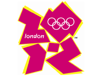
2012 Logo
Posted: Mon 4 June, 2007 Filed under: 1BEM, Charm School, Cynicism, Thoughts 5 Comments »OK, now just what the fuck is the new logo for the London 2012 Olympics supposed to be representing?
The old logo with the outline of the Thames running through it at least made sense.
This one looks more like a four-year-old has been playing with pink post-it® notes and scissors…
EDIT : Ok, having looked at the logo a bit more, I can now discern the ‘2012’ in the pink bits of the logo. So it makes a bit more sense now. Still looks like shite to me though. Then again, I’m neither a designer nor a marketer.

But you recognise shite when you see it. I wonder what the corporate bollocks that descibes it says. I’m sure that it will be a robust piece of bollocks.
I also find that font they’ve used for the ‘london’ offensive.
[…] is not a huge amount to be said about the shape that hasn’t been said in a Lyle’s short post, but there is one thing really annoying me: the […]
London 2012? I was wondering what London Zo>Z was.
Sometimes I weep for humanity.
It’s crap, lacks imagination… doesn’t get you all fired up with national pride. Where are the olympic colours that every other country has incorporated in years gone by. They’ve just thought ‘nah dont like any of those colurs I know lets have magenta’… oh what an inspiring colour that is! As usual we fall short of what is required, just got no idea.